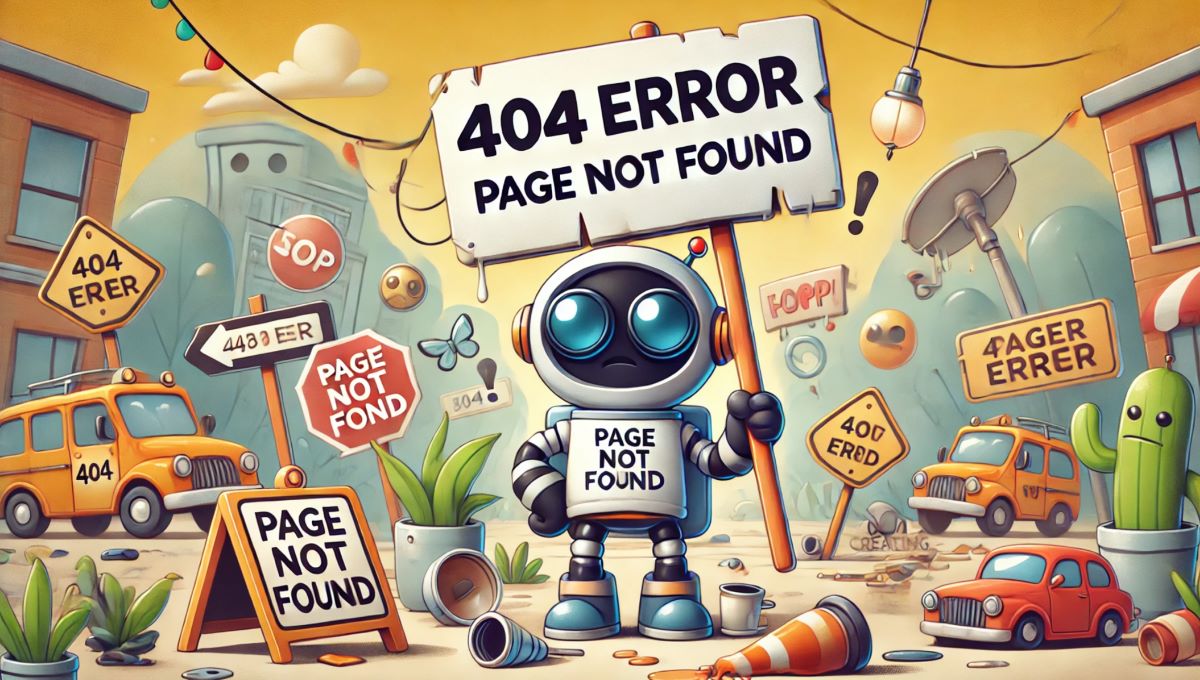
Encountering a 404 error page can be a frustrating experience for users. A 404 error occurs when a user tries to access a page that does not exist on a website. However, a well-designed 404 error page can turn a potential negative experience into a positive one. By providing clear guidance and useful links, you can help users find the information they’re looking for and keep them engaged with your site. This article explores the key elements of an effective 404 error page and offers tips for creating one that enhances user experience.
1. The Importance of a 404 Error Page
A 404 error page is a crucial part of any website. While the goal is to minimize the occurrence of 404 errors, they are sometimes unavoidable due to broken links, mistyped URLs, or removed content. An effective 404 error page can:
- Reduce Bounce Rates: By providing helpful navigation options, you can encourage users to stay on your site rather than leaving.
- Enhance User Experience: A well-designed 404 page can turn a frustrating experience into a positive one, reflecting well on your brand.
- Maintain SEO Value: Redirecting users to relevant content can help retain the SEO value of the original page.
2. Key Elements of an Effective 404 Error Page
To create an effective 404 error page, consider incorporating the following elements:
2.1 Clear Message
Provide a clear and concise message informing users that the page they were looking for cannot be found. Avoid technical jargon and use simple language. A friendly and apologetic tone can also help mitigate user frustration.
<h2>Oops! Page not found</h2>
<p>We’re sorry, but the page you were looking for doesn’t exist.</p>
2.2 Useful Links
Include links to popular pages on your site, such as the home page, blog, or contact page. This helps users find their way back to relevant content and encourages them to continue exploring your site.
<p>Here are some helpful links to get you back on track:</p>
<ul>
  <li><a href="/">Home</a></li>
  <li><a href="/blog">Blog</a></li>
  <li><a href="/contact">Contact Us</a></li>
</ul>
2.3 Search Bar
Including a search bar on your 404 error page allows users to quickly search for the content they were trying to find. This can significantly improve the user experience and help them locate relevant information.
<form action="/search" method="get">
  <input type="text" name="q" placeholder="Search our site...">
  <button type="submit">Search</button>
</form>
2.4 Visual Appeal
A visually appealing 404 error page can make a positive impression on users. Use your site’s branding, colors, and fonts to create a cohesive look. Consider adding images or graphics that reflect your brand’s personality.
2.5 Humor and Creativity
Adding a touch of humor or creativity to your 404 error page can make the experience more enjoyable for users. A clever message or fun graphic can help alleviate frustration and leave a positive impression.
<h2>Lost in Space?</h2>
<p>It looks like you’ve drifted into the unknown. Let’s get you back to safety!</p>
<img src="/images/lost-in-space.png" alt="Lost in Space">
3. Best Practices for Designing a 404 Error Page
When designing your 404 error page, follow these best practices to ensure it is effective and user-friendly:
3.1 Keep It Simple
Avoid cluttering your 404 error page with too much information. Focus on providing a clear message, useful links, and a search bar. A clean and simple design is easier for users to navigate.
3.2 Maintain Consistency
Ensure that your 404 error page is consistent with the overall design and branding of your site. This includes using the same colors, fonts, and logos. Consistency helps reinforce your brand identity and provides a cohesive user experience.
3.3 Optimize for Mobile
Make sure your 404 error page is mobile-friendly. With an increasing number of users accessing websites on mobile devices, it’s important to ensure that your 404 page looks and functions well on all screen sizes.
3.4 Monitor 404 Errors
Regularly monitor your website for 404 errors using tools like Google Analytics. This can help you identify broken links and pages that need to be fixed. Additionally, monitoring can provide insights into user behavior and how they interact with your 404 page.
3.5 Provide a Way to Report Issues
Include a link or form that allows users to report broken links or other issues. This feedback can help you identify and fix problems quickly, improving the overall user experience.
<p>If you think this is a mistake, please <a href="/contact">contact us</a> to let us know.</p>4. Examples of Effective 404 Error Pages
To inspire your own design, here are a few examples of effective 404 error pages from various websites:
4.1 GitHub
GitHub’s 404 error page features a playful image of an octocat astronaut and a clear message informing users that the page cannot be found. It also includes links to the home page and search functionality.
4.2 Airbnb
Airbnb uses a clean and simple design for its 404 error page, with a friendly message and links to popular sections of the site. The page also includes a search bar to help users find what they’re looking for.
4.3 Pixar
Pixar’s 404 error page showcases the studio’s creativity with a fun animation of the character Sadness from the movie Inside Out. The page provides a clear message and links to the home page and other sections.
5. Conclusion
Creating an effective 404 error page is essential for maintaining a positive user experience and keeping visitors engaged with your site. By providing a clear message, useful links, search functionality, and a touch of creativity, you can turn a potential frustration into an opportunity to delight your users. Follow the best practices outlined in this article to design a 404 error page that reflects your brand and helps users find the information they need.
Remember, a well-designed 404 error page not only improves user experience but also enhances your website’s overall effectiveness and professionalism. Take the time to create a thoughtful and user-friendly 404 error page, and your visitors will appreciate the effort.


 Popular Posts